Home Practice
For learners and parents For teachers and schools
Past papers Textbooks
Mathematics
Mathematics Grade 7 Mathematics Grade 8 Mathematics Grade 9 Mathematics Grade 10 Mathematics Grade 11 Mathematics Grade 12
Mathematical Literacy
Mathematical Literacy Grade 10
Physical Sciences
Physical Sciences Grade 10 Physical Sciences Grade 11 Physical Sciences Grade 12
Natural Sciences
Natural Sciences Grade 4 Natural Sciences Grade 5 Natural Sciences Grade 6 Natural Sciences Grade 7 Natural Sciences Grade 8 Natural Sciences Grade 9
Life Sciences
Life Sciences Grade 10
CAT
CAT Grade 10 CAT Grade 11 CAT Grade 12
IT
IT Grade 10 IT Grade 11 IT Grade 12
Full catalogue
Leaderboards
Learners Leaderboard Grades Leaderboard Schools Leaderboard
Campaigns
Headstart #MillionMaths
Learner opportunities Pricing Support
Help centre Contact us
Log in

We think you are located in South Africa. Is this correct?

Introduction

Test yourself now

High marks in science are the key to your success and future plans. Test yourself and learn more on Siyavula Practice.

Sign up and test yourself

Chapter 23: Graphs

23.1 Introduction

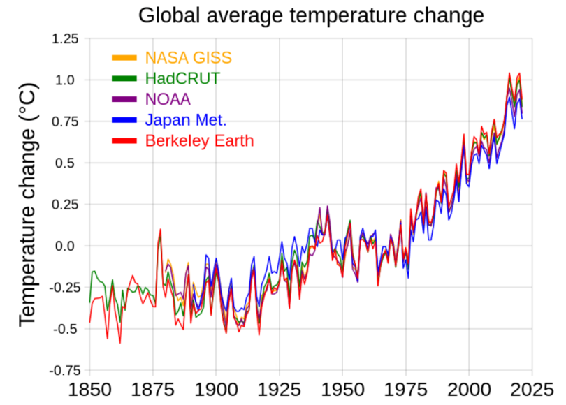
Graphs are a visual representation of information that make it easier for people to understand the data that is being shown. A graph can also make it easier to identify a pattern or a trend in the data.

For example, a table of values of global average temperatures would not have the same impact as the graph below. The graph makes it very clear how global average temperatures have increased over the past 175 years.

RCraig09, CC BY-SA 4.0, via Wikimedia Commons

The graph shows temperature data from five different scientific organisations:

  • NASA Goddard Institute for Space Studies (US)
  • HadCRUT (Met Office Hadley Centre, UK)
  • National Oceanic and Atmospheric Administration (US)
  • Japan Meteorological Agency
  • Berkeley Earth (US)